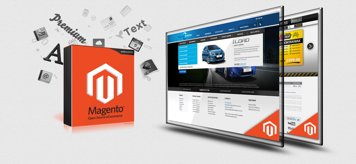
Having chosen Magento for your store, you probably feel accomplished with your adept choice. But now, the next step is to make efforts to have it stand out from the sea of existing online stores. In order to stand out, it is important that a store owner gives special attention to how the store is designed. It is worthy to note that an optimum design is a mix of unique and trending design elements, both. While unique attributes stem from unique store requirements, trending design attributes give a store, a modern and fresh look, which certainly cannot be delivered by the use of old design attributes. As no store owner would like their store to look outdated, the activity of observing design trends is a highly useful one. In addition to giving useful design ideas to store owners, design trends are also an asset to novice designers who are seeking design inspiration.

Let us see what are the most relevant trends that must be observed in the process of Magento website design:
Flat Design
This style of designing is primarily based on minimalism and the use of bright contrasting colours. Flat design conveys information efficiently discarding the need for a lot of complementing textual content. The trending design attribute allows store visitors to absorb essential information quickly and easily.
Large Background Images
A large background image on the landing page of an online store can create an immense impact on customers, driving them to explore the store further. Moreover, large background images create more of white space, rendering a clean overall look to the store.
Background Videos
A background video can be either used to tell a story of your product/team or used to showcase the usage of your product by featuring a customer using it. While the former works in favour of impressing your customers with your story, the latter provides customers with an idea about how your product is to be used. While incorporating a video in your store’s background may appear a difficult task, a Magento Developer can perform the task easily.
Negative Space
Negative or white space refers to the space that is devoid of text and design elements on a web page. Having more of negative space on the web pages of your store gives it a clean and clutter-free look, thereby rendering an exuberant overall user-experience. Furthermore, negative space draws more attention of customers to the content and call-to-action buttons of an online store.
Grid/Card Layout
The layout gives a clean and minimalist look to a website. Additionally, the layout organizes information effectively into neat boxes. The layout can be used to shed information on new discount offers and new products.
Graphic Illustrations
Custom graphic illustrations render stores a unique and creative look. The feel provided by these illustrations can vary depending on the values of your company and the kinds of products you sell. For instance, a store selling baby items can have an illustration of babies.
Hover Effects
Hover effects refer to the animated effects rendered by website elements when the cursor is hovered over them. In an online store, hover effects can be used for icons such as the shopping cart and wishlist icon.
It is worthy to note that the above-mentioned trends can be easily incorporated into a Magento store by a Magento Development Company, thereby allowing store owners to relax while an ideal mix of unique and trending elements are brought alive.